From Empathy to Elegance: Mastering Visual Design for a Powerful UX
Visual design is the spirit of the UX as a final stage, to polish your user experience and empower it by adapting the visual design principles, giving the user the recognizability of what I meant by communicating the user empathy.
The elements of visual designs are many, like colors, spaces, fonts, structure, images, etc.
And to manage all these aspects, some principles help you to find your way by using and adapting these design principles, which are :
- Unity and Harmony
- Balance
- Hierarchy
- Scale and Proportion
- Dominance and Emphasis
- Similarity and Contrast
All these principles/guidance rules are connected and affect your whole design approach, so as a reflection of my exercise, I couldn't do the hierarchy by doing the Dominance and emphasis alone, so it's tough to start doing these criteria one by one. from my exercise you have to do them all in one time to have the desired look and experience, and you can add above of that, especially in the digital environments the way of the (transitions and interactions)
So I divided the screen into two parts using the golden ratio to have this aesthetic & balanced view in positioning the design elements and the emphasis aspect.
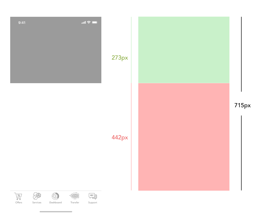
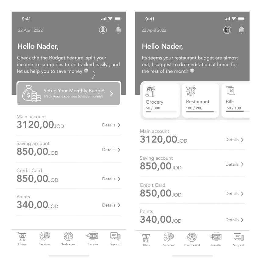
So at the upper part (dark gray), I used it to emphasize the communication area with the user by displaying all the due bills, alerts, advertisements, budgeting tips, personalized messages, etc. This is the most dynamic area.
Here, you can see the hierarchy of the design components from the above to the end, starting with the communication part, then the budgeting component that shows the balance according to assigned categories, then the details of his accounts from the main account until the points balance that he gained.
At the bottom of the screen, I placed the tab action bar as global navigation, which should appear all around the app screens at the first level screens.
For the color palette, I tried many options. I went through many iterations to find the harmony and the combination, so by doing my research on related apps in the same financial industry, I found that Blue is a good indicator of finance activity; it gives the user the feeling of trust and honesty as it instills confidence and inspires feelings of loyalty and integrity. In addition, the JOD currency has two denominations in blue color.
The colors used are as the following:
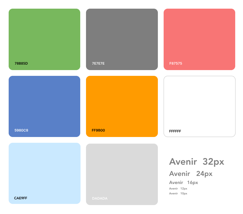
White color: the base to make the spaces and clarity, especially some many numbers and elements should be readable.
Dark Blue color: emphasizes some areas and distinguishes between screen parts, and I used it for text links and icons all over the app.
Light Blue: I used to highlight some areas and text on the dark blue background to give me more ability to hierarchy my content.
Dark Gray: I used the text numbers on the white background.
Light Gray: separators/ lines and inputs.
Green/ Red colors: I used them to recognize between your transaction IN/OUT money easily, and these colors are heavily utilized in the financial industry for the same purpose.
Orange color: the action design elements in my design and the interaction component tell the user what to do and guide him to end his task—also, the orange color indicator of activity, confirming, and power.
The typography elements affect the user experience on many sides, like readability, credibility, and feeling. By choosing Avenir font, I benefited from the font weights; this font has many weights that helped me emphasize and hierarch my design elements.
Also, Avenir font is a modern font from google library and is compatible with different digital platforms, so it helps with consistency.
And here we go as a final result for the main landing screen (Dashboard), complying with all the design principles and using fonts and colors to have the desired impact and shape my design clearly from the User perspective.

Reference cited:
Esposito, E. (2018). The Golden Ratio — What It Is and How to Use It in Design. [online] www.invisionapp.com. Available at: https://www.invisionapp.com/inside-design/golden-ratio-designers/ [Accessed 24 Mar. 2022].
Aragon, K. (2013). 15 Color Palettes from Top Financial Websites. [online] The Daily Egg. Available at: https://www.crazyegg.com/blog/color-palettes-financial/ [Accessed 27 Mar. 2022].
Gordon, K. (2020). 5 Principles of Visual-Design in UX. [online] Nielsen Norman Group. Available at: https://www.nngroup.com/articles/principles-visual-design/.
Bruna (2020). Meaning of the Color Blue: Symbolism, Common Uses, & More. [online] Colors Explained. Available at: https://www.colorsexplained.com/color-blue-meaning-of-the-color-blue/.
Today's Eggspert (2018). 16 Great Website Color Palettes to Increase Engagement (2019). [online] The Daily Egg. Available at: https://www.crazyegg.com/blog/website-color-palettes/ [Accessed 27 Mar. 2022].
Source: https://bootcamp.uxdesign.cc/week-8-visual-design-ac5d29d7f41d