Responsive layout/ Grid system
Nowadays, websites are used by users on different platforms and devices. And the good news most of these sites, especially the services and extensive sites, have followed a responsive layout to serve user needs and behaviors.
So in this week's topic, we went over these approaches to find out the difference between them, and how these structures will impact your design layout, and affect your user target.
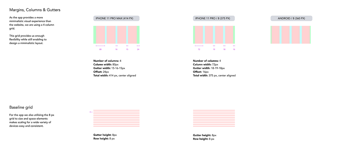
To start a responsive layout, you have to structure your design using a grid system. This will assist you in arranging your design elements to avoid un justifying design objects issues from spaces, padding, and margins and help the user easily distinguish your whole design parts.
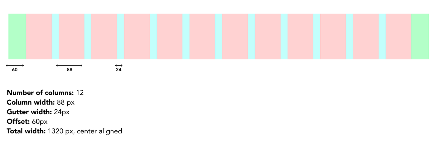
The most usable grid system is the 8pt grid, Why?
It's easy to scale your design using this logic of 8pt, especially in the different sizes of mobile screens. And it's not only used for the design layout or the main container, it's used for all the design elements, text and icons, and the verticals spaces as well, which gives complete control of all the design elements.
The 8pt is the multiples of 8:

Using this principle for icons, text, and images and your whole design canvas, you will find your design balanced and save a lot of time by arranging and finding the appropriate spaces; also, it's compatible with differences in screens' mobile proportions.
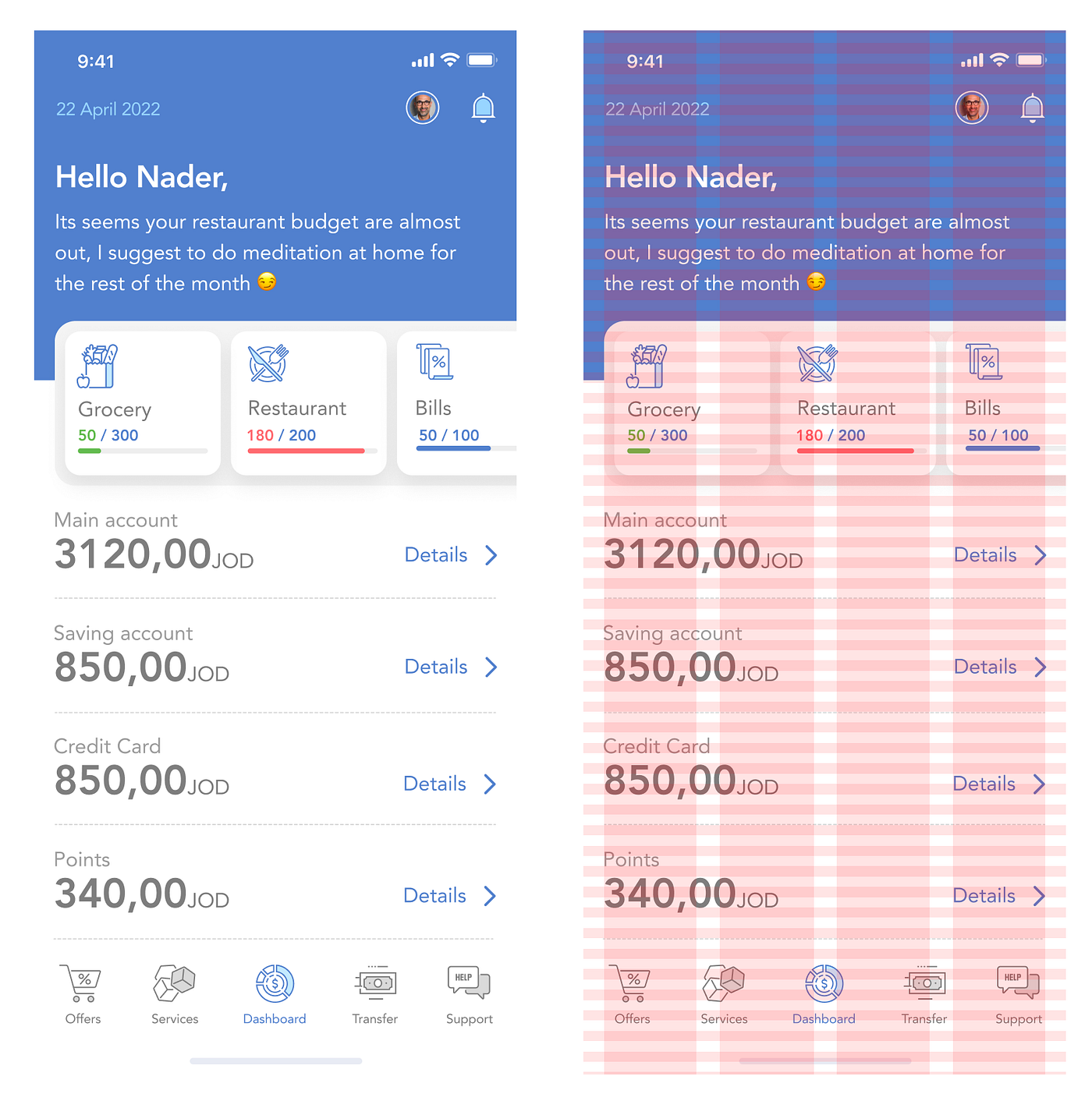
Here is a sample of the used icons using 8pt on mobile devices screen (four columns)
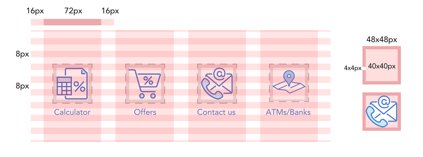
Mobile screen Grid:
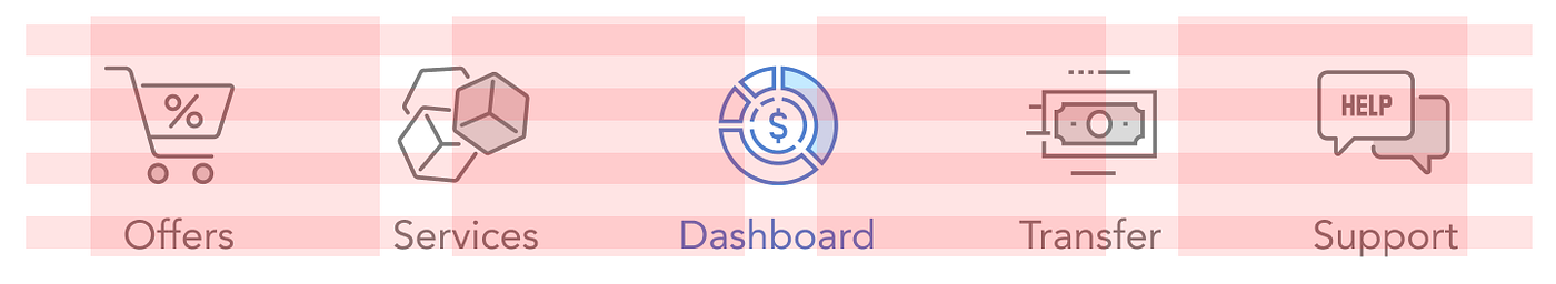
For the bottom action bar, the max-width of the icon size is 32px offset around it is 40px, the padding width 32px between them.
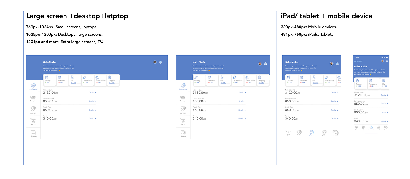
Despite the fact that my service is a native mobile app, especially at this stage as an MVP, I will check the web to see how many changes I have to be aligned with user needs and the hierarchy; the result came as the following.
From size 1440px, the wide desktop screen until the size 960px using the 8pt grid system, I don't have changes in the designs for rearranging design and the structure.
And from size 600px until 320px, it back again to the mobile view to cover these screen sizes, so as a result, I don't need to do an adaptive design, so the responsive design is fair enough for me by using a column shifter as a responsive method by removing the action bottom bar to be a left column navigational.
- 320px — 480px: Mobile devices.
- 481px — 768px: iPads, Tablets.
- 769px — 1024px: Small screens, laptops.
- 1025px — 1200px: Desktops, large screens.
- 1201px and more — Extra large screens, TV.
Reference cited:
Vitsky (2021). The Comprehensive 8pt Grid Guide. [online] The Startup. Available at: https://medium.com/swlh/the-comprehensive-8pt-grid-guide-aa16ff402179 [Accessed 30 Mar. 2022].
Rumman (2022). Everything You Should Know About 8 Point Grid System in UX Design. [online] Medium. Available at: https://uxplanet.org/everything-you-should-know-about-8-point-grid-system-in-ux-design-b69cb945b18d#:~:text=The%20principle%20of%208pt%20Grid [Accessed 30 Mar. 2022].
Mads Soegaard (2019). Adaptive vs. Responsive Design. [online] The Interaction Design Foundation. Available at: https://www.interaction-design.org/literature/article/adaptive-vs-responsive-design [Accessed 30 Mar. 2022].
Eygi, C. (2020). Media Query CSS Tutorial — Standard Resolutions, CSS Breakpoints, and Target Phone Sizes. [online] freeCodeCamp.org. Available at: https://www.freecodecamp.org/news/css-media-queries-breakpoints-media-types-standard-resolutions-and-more/ [Accessed 30 Mar. 2022].
Source: https://medium.com/design-bootcamp/week-9-responsive-layout-grid-system-b6faa7bfd7aa