Prototype & Test: The Shortcut to User-Centric Design
The prototype is a method that makes you create the story to test, validate, find the gaps, and refine the experience and the context to be suitable for the target audience to achieve their required task.
for me, I prefer to do it right after the diagram flow and define the user stories by mapping all the steps to check his reaction by using your services, if the service left the assumed Impact and the impression that you are looking for or not,
So by doing usability testing on your product/ service, you always get the proper feedback and precision for each design U.I. element that should be revised to enhance to be more fitted and appealing for your users.
The moderator usability testing gives you more insights as a qualitative result; So you can ask, have more impressions, and lead you to the right decisions in the designs. But the thing here is that you have to check what they are doing and match it with their feedback because sometimes they don’t match.
Each usability test is associated with a task; you can’t start testing your product by not giving a specific task flow to let you have accurate remarks and suggestions.
And the more important thing while doing the test is to prepare your assessment sheet and give weights for each usability aspect to be filled by the observer.
In addition to the above, you have to consider the limitations that occur by using the prototype tools, so you can't cover all the cases in the same flow; your focus will be on the happy scenarios/ flows because you can’t mimic the actual experience with all what have from issues.
the benefit of the prototype and usability testing is that it’s easy to do and has a tremendous:
- Saving time
- Quick enhancement
- Find all the uncovered cases
- Help all the contributors to imagine the product/ service flow.
- Check multiple experiences as A/B testing to adopt the succeeded experience.
- Help you to create the proper context and content.
In my challenge activity for this week, I created a prototype for an onboarding wireframe to let user register their account in the app.
As I mentioned above, I covered the happy scenario, despite I got many remarks that helped me to improve the flow, like:
I added one input to enter the password for login. However, I tend to make it easy to remember, So I limited this to four digits in the registration; after receiving feedback, I made four separate inputs for each number.
Another thing here is Adding More descriptions under each input to explain why I’m asking for this input, to avoid any confusion, and to give the credibility feel.
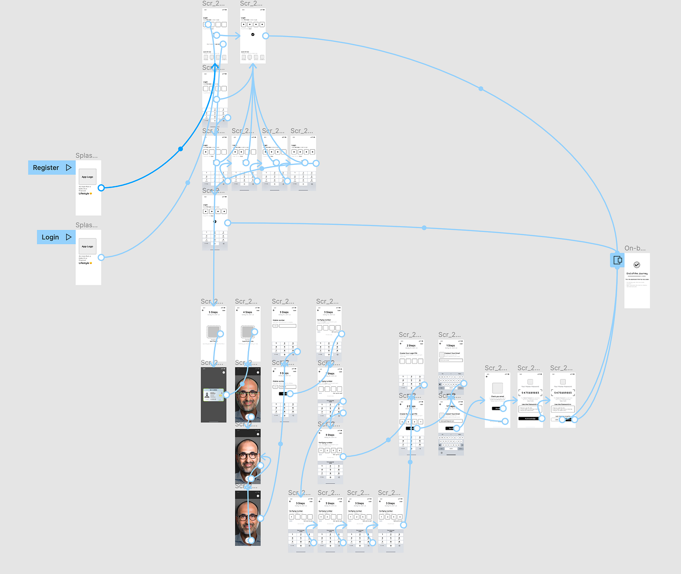
Prototype:
Reference cited:
Experience, W.L. in R.-B.U. (2016). Checklist for Planning Usability Studies. [online] Nielsen Norman Group. Available at: https://www.nngroup.com/articles/usability-test-checklist/ [Accessed 13 Mar. 2022].
Source: https://medium.com/@naderalazzeh/week-7-prototyping-usability-50e9baca617band