Artifact Review: Refining Content and Messaging for Clarity and Impact
Content helps me emphasize and give a clear message to my user; many sessions have been done with the users to have the desired impact by changing the icons, text, and communication style.
All of these impact your user experience, and you must test them.
So, It should be revised again and again to match user expectations.
I manage my app to speak a friendly and close language based on my user persona and approach. So I always use the user name even in the early stage (Registration stage). Change all the actions to be more actionable to confirm the objectives and meet the user’s attention and expectations from each step.
Specifically, in my communication area, which has all the interaction messages that need to attract user attention, I made many changes to have this attention by font size, length of the sentence, clarity, and tone that I need to deliver. All these should be combined and test it until you have a solid base that can make you go forward with this approach. Unless that, you must make a significant change even in the screen structure to have what the user wants.

For example, “set up a monthly budget.” is a call to action to drive the user to start his journey by setting his budget.
The first time, I added an icon to emphasize. I made the edges sharp, this look gave the user the feel of the advertisement banner, and the user always tended to avoid looking at these components.
So by removing this icon on the left beside the Text and making the edges curvier, I got a fair attraction from their users. Also, By adding an arrow that should empower the message to read more about it, all these enhancements were done by usability testing. Here, the UX writing ng your content e more appealing and achieves what they want.
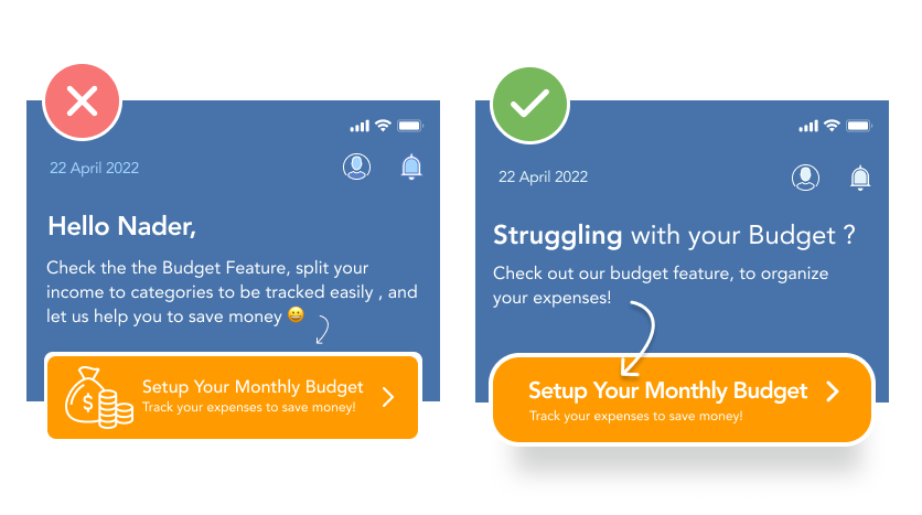
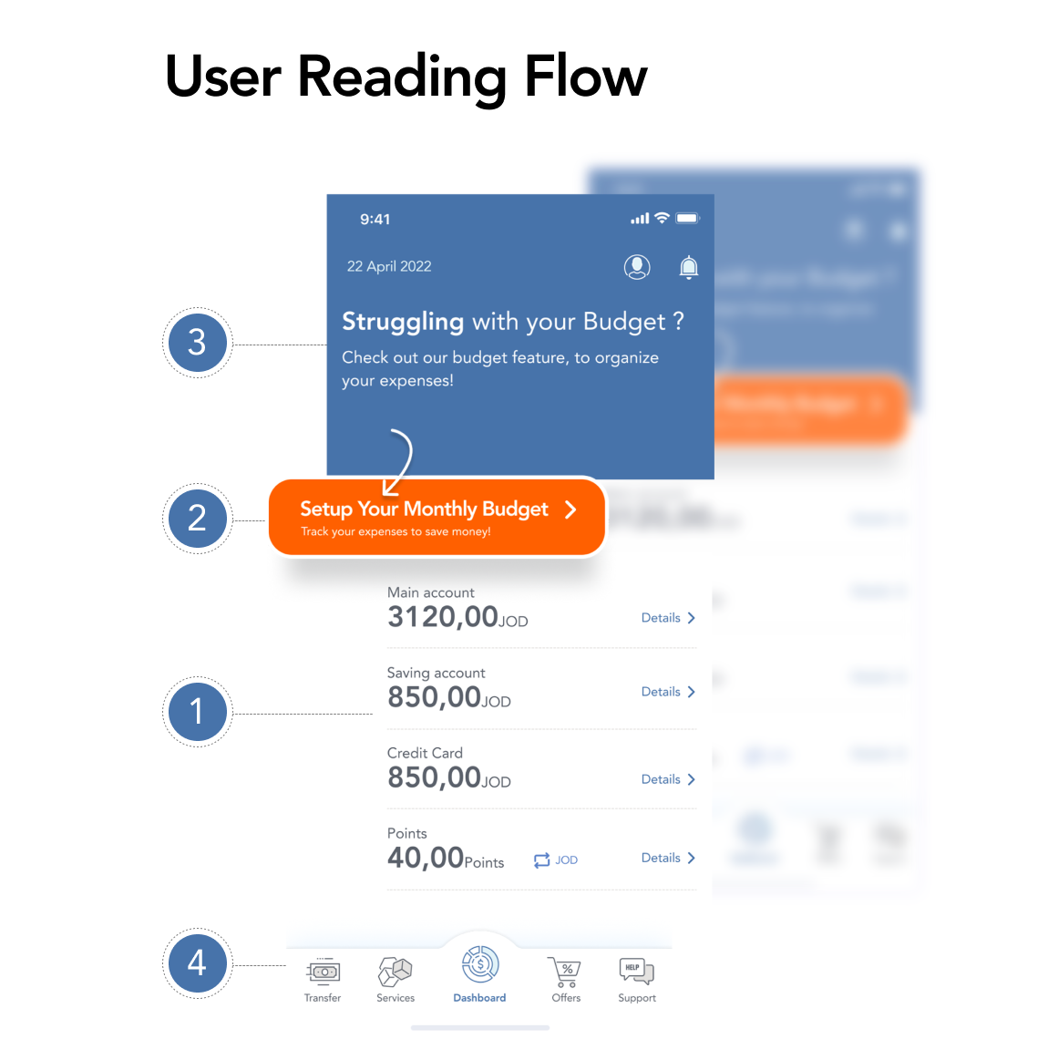
In the above screenshot, you can notice the enhancement done to meet user needs and emphasize the feature value.
Moreover, these exercises happened on each part of the app to maintain the experience and the tone.
What surprised me! Sometimes users ignore some things that are essential from my point of view. So this is the best way to experiment and feel the improvement by changing the content and managing your UX writing in your product; even the tiny things can change how users read your content.
Reference cited:
Evans, H. (2017). ‘Content Is King’ — Essay by Bill Gates 1996. [online] Medium. Available at: https://medium.com/@HeathEvans/content-is-king-essay-by-bill-gates-1996-df74552f80d9 [Accessed 16 Apr. 2022].
Babich, N. (2020). 16 Rules of Effective UX Writing. [online] Medium. Available at: https://uxplanet.org/16-rules-of-effective-ux-writing-2a20cf85fdbf [Accessed 16 Apr. 2022].
Experience, W.L. in R.-B.U. (n.d.). The Four Dimensions of Tone of Voice in UX Writing (Video). [online] www.nngroup.com. Available at: https://www.nngroup.com/videos/tone-of-voice-dimensions/ [Accessed 16 Apr. 2022].
Romano, J. (2021). UX Writing: What Is It + 12 Tips for Effective UX Copy. [online] https://www.wix.com/blog. Available at: https://www.wix.com/blog/2021/11/ux-writing/?utm_source=google&utm_medium=cpc&utm_campaign=16242205830^136002928760&experiment_id=^^582527080206^^_DSA&gclid=EAIaIQobChMIipbo8Z7E9wIVRIXVCh28hAqGEAAYAyAAEgIm-vD_BwE [Accessed 16 Apr. 2022].
Source: https://medium.com/design-bootcamp/week-10-content-ux-writing-3a628a643bb6